NWTN
Interaction Design, design system

Product intro
NWTN is a concussion tracking app for high school football coaches and athletic trainers. Paired with bluetooth devices that clip into the players' helmets, the NWTN app is able to record and track impacts for each player based on a their individual impact thresholds. NWTN prominently features a live game mode where coaches can view impact details as they happen during the game. We received wireframes from our client, and were tasked with creating high fidelity mock-ups.
NWTN was featured on the TBS show America's Greatest Makers.
Disclaimer: This project was completed under the pseudonym "ENSTN" while under a NDA.
CHALLENGE
Building easily readable interfaces that are can be quickly understood at a glance, allowing users to react in the moment and on the go.
Step 1: RESEARCH AND DESIGN PRINCIPLES 🔍
Our team of 4 started our design process with a thorough competitive analysis and market research from both an industry and functionality standpoint. While we needed to make sure ENSTN stood out amongst its direct competitors in the impact tracking industry, we also needed to break down each of the functions – live game tracking, player/team organization, and visualization – to ensure ENSTN would be competitive in each of those domains.
Following our research, we established our design principles based on two primary user groups - the athletic trainer and the football coach. Both of these users relied on making split second decisions and while having their eyes on the game. They would be using this technology to make informed decisions on whether to keep a player in the game after an impact.
Glanceable
Data needed to be readable and digestible at a glance.
SIMPLE
Data points should be boiled down to their simplest components.
APPROACHABLe
Functions should follow recognizable patterns to flatten the learning curve
Step 2: STYLE EXPLORATION 🏔
Research and design principles guided my style exploration:
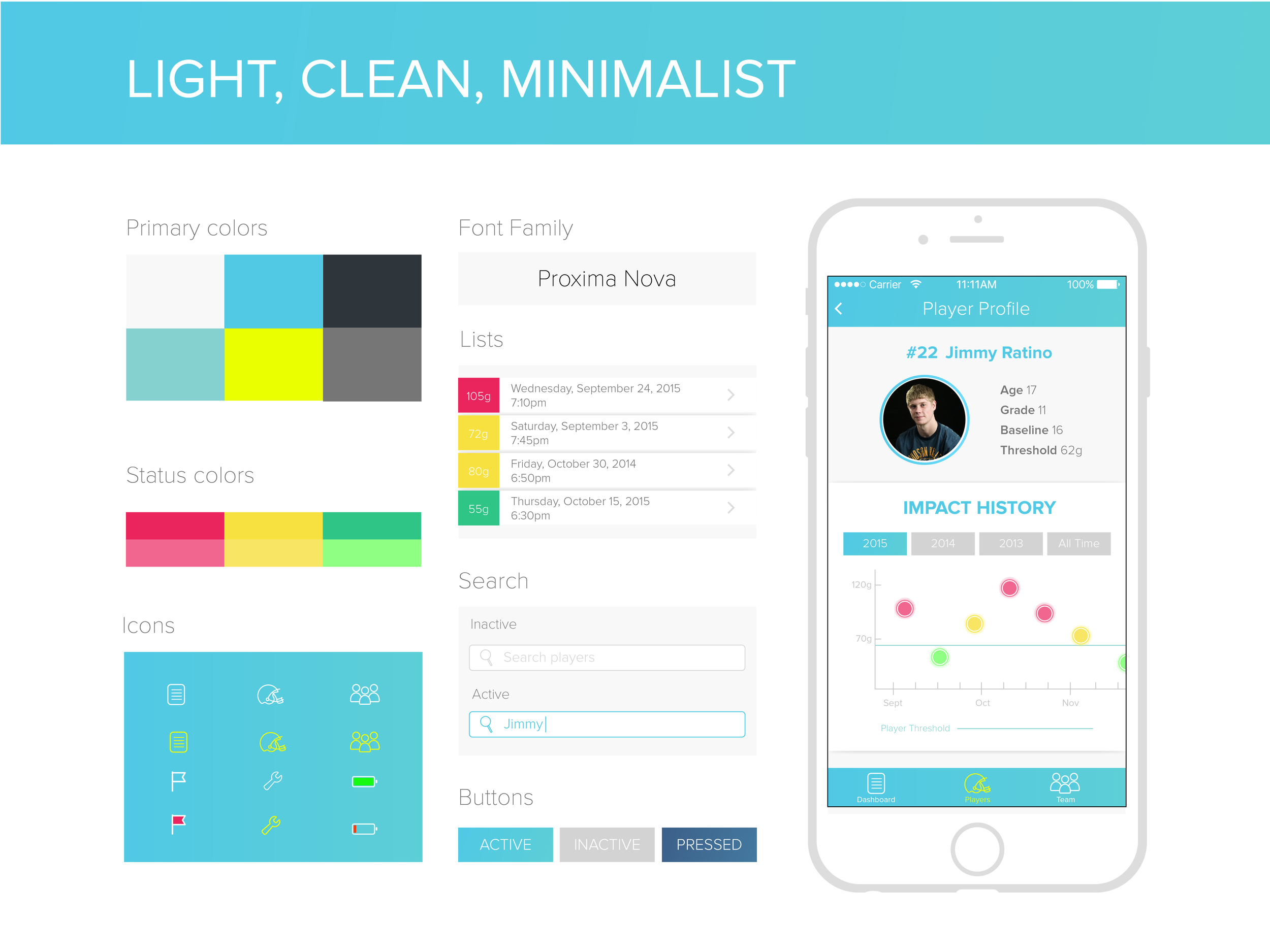
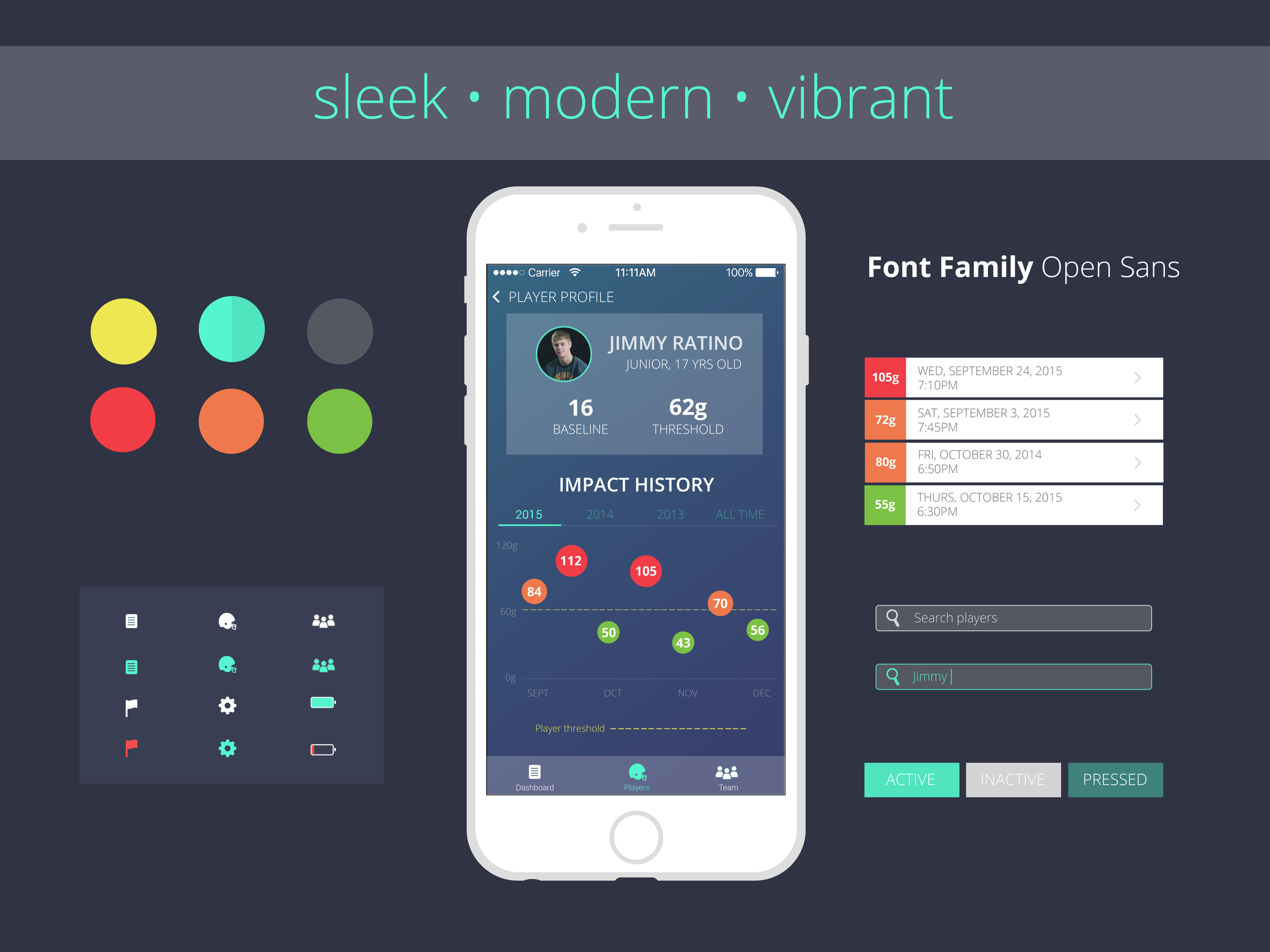
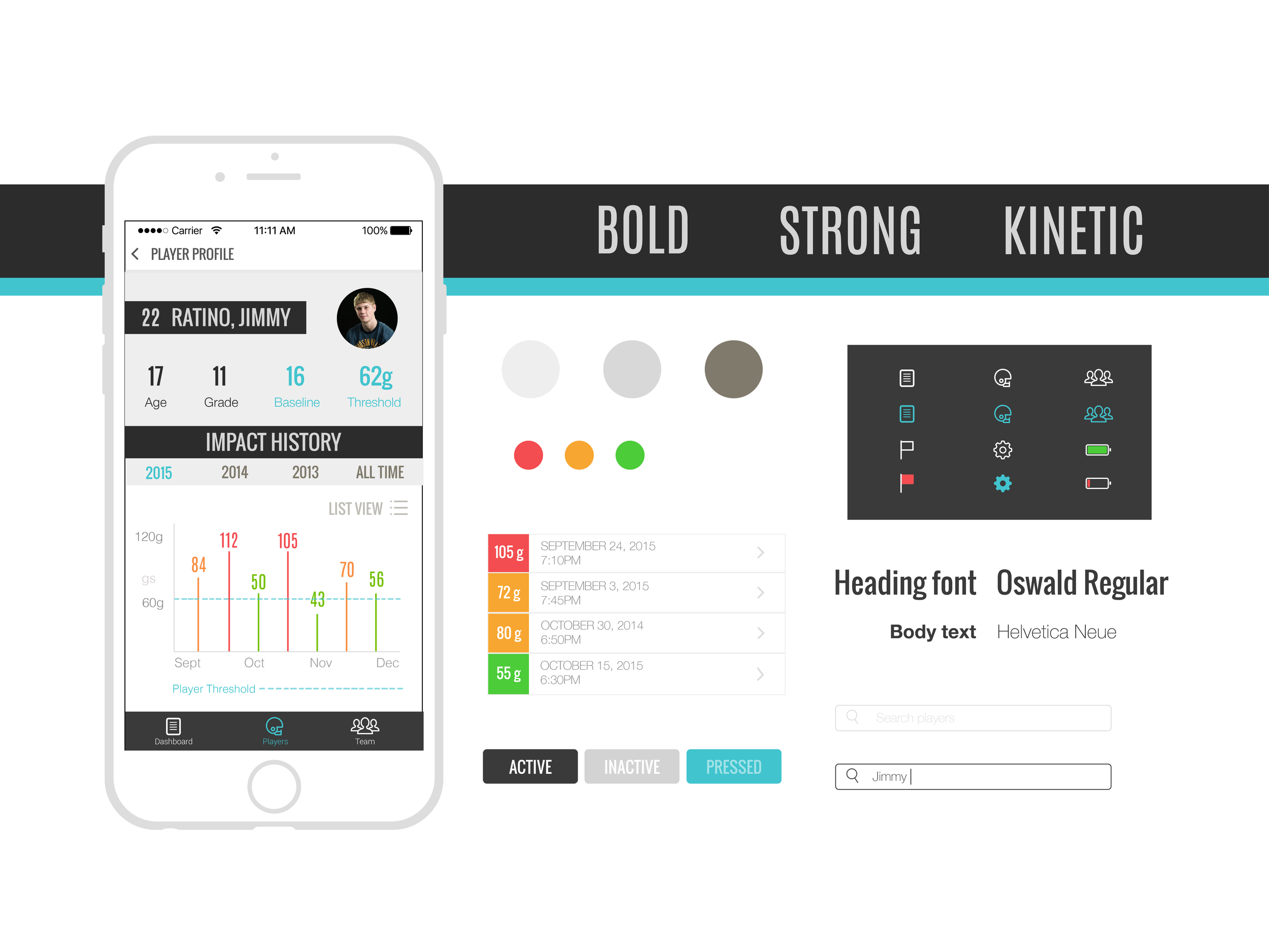
Step 3: DATA VISUALIZATION 📈
While we were given wireframes by the UX team, a key component (and challenge!) of our design process was to explore different effective ways of displaying data.
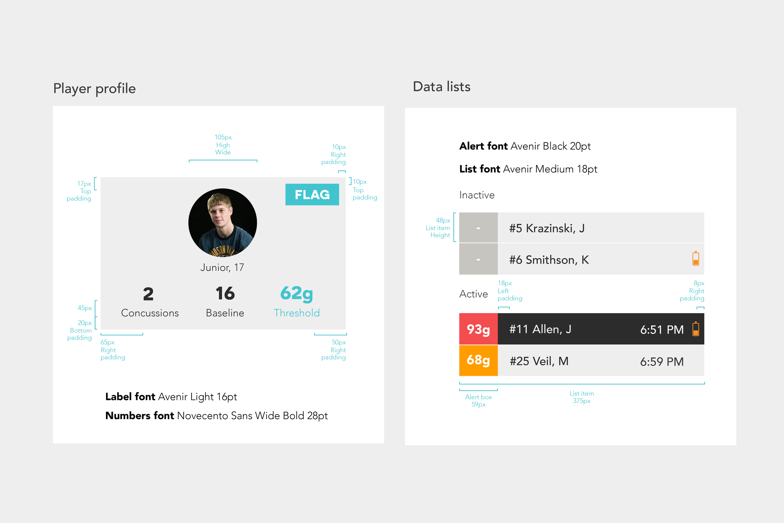
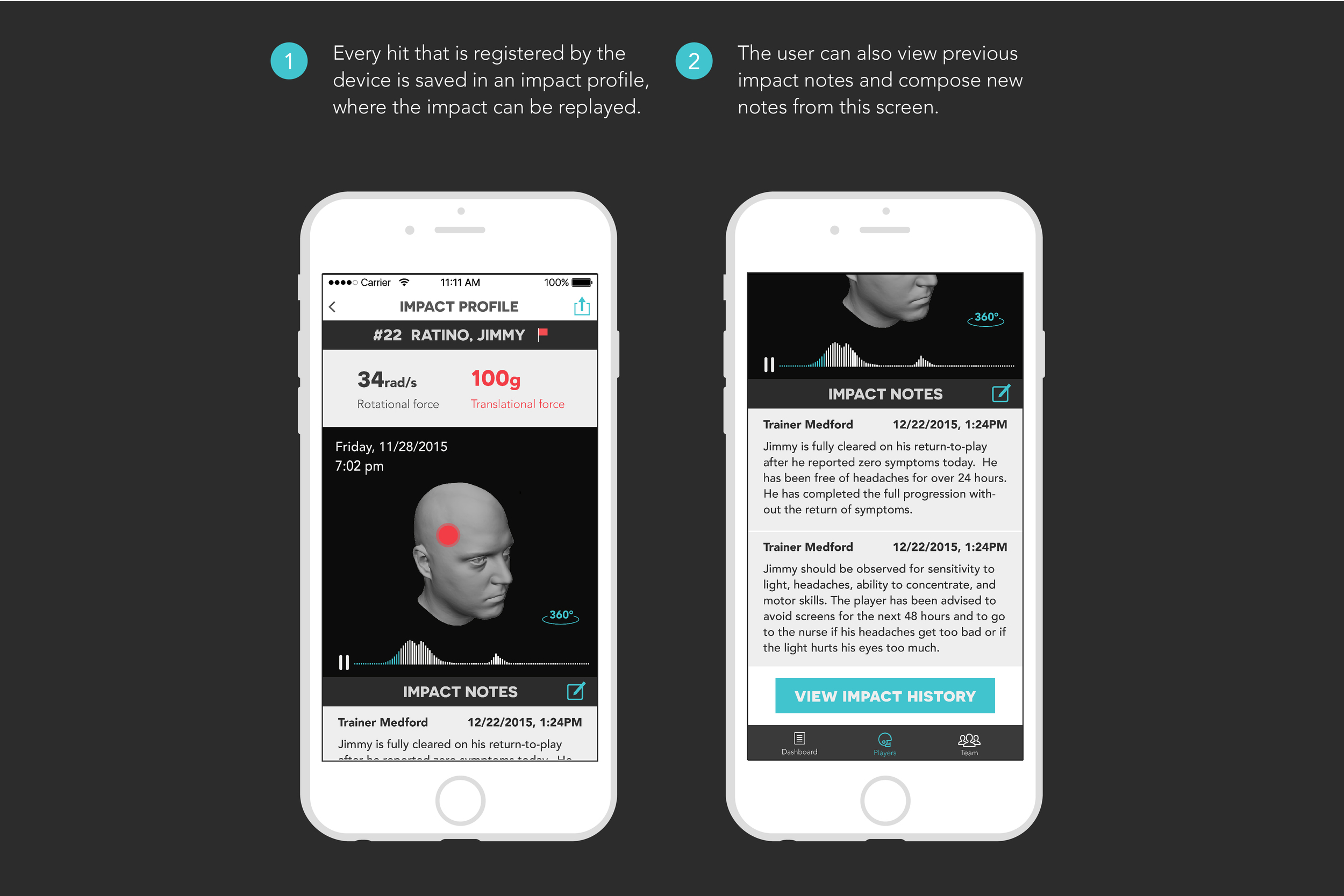
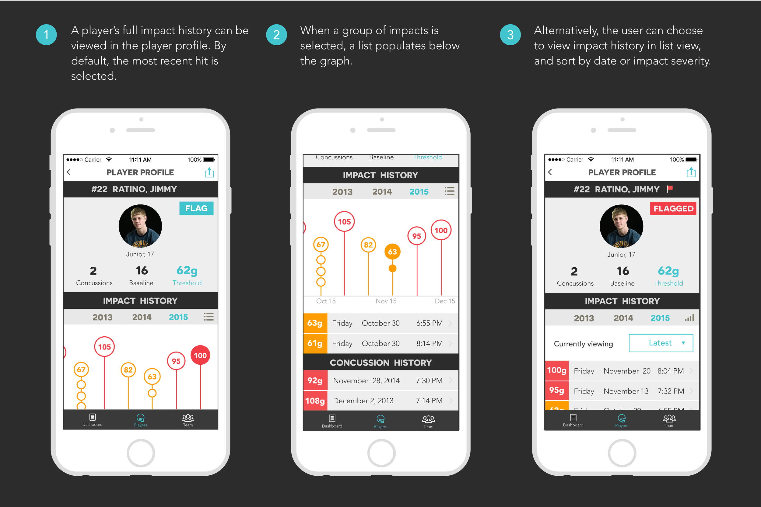
On each player profile, there is a graph to display recent impact history (measured in G-forces). Each player has a different threshold for impact, which would be set manually by the trainer or coach. Hits above the threshold would then be closely monitored, and given special attention.
Initial ideas considered including all hits above and below the threshold, and a couple of different ways of organizing and displaying data – by day, by season, or by year.


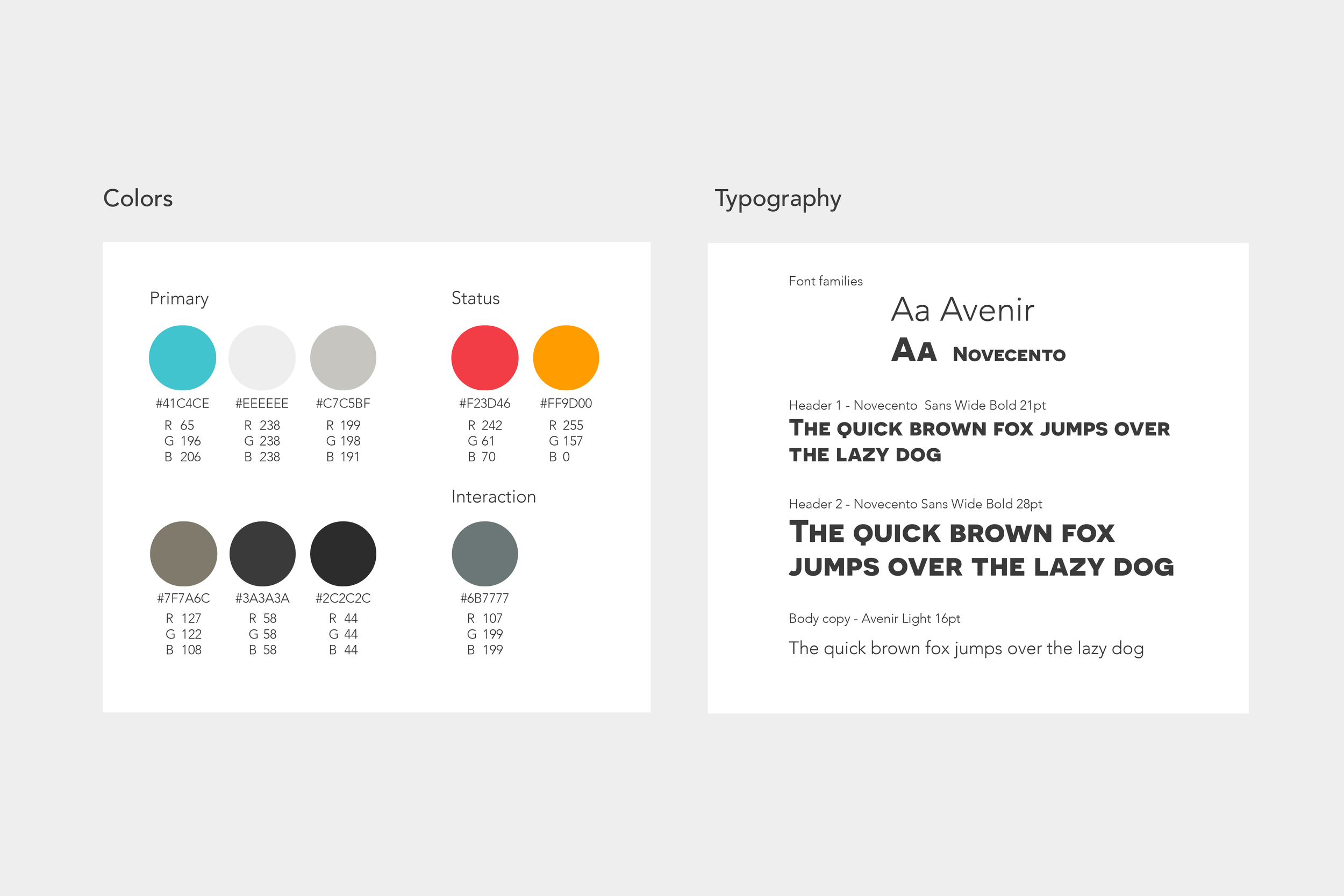
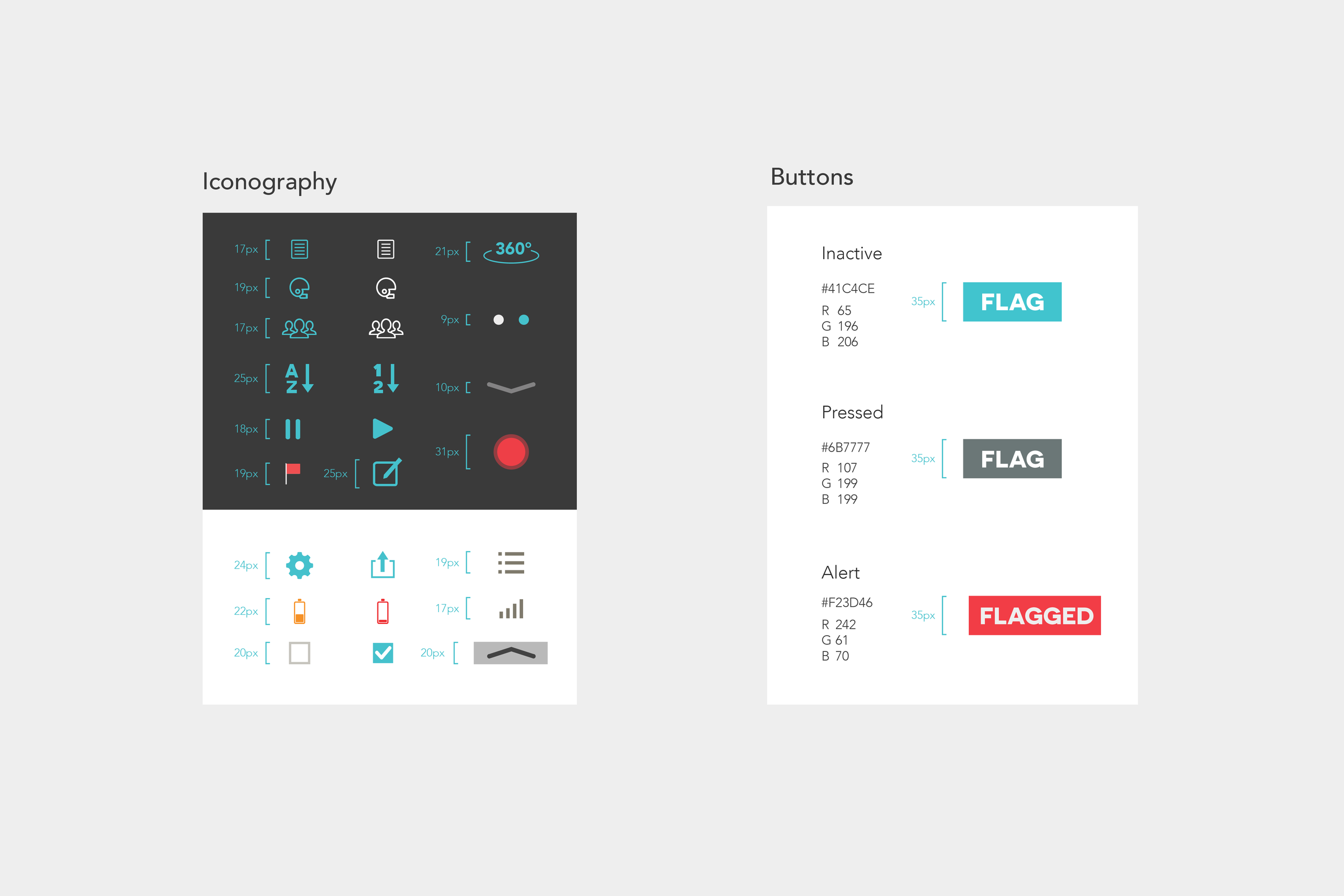
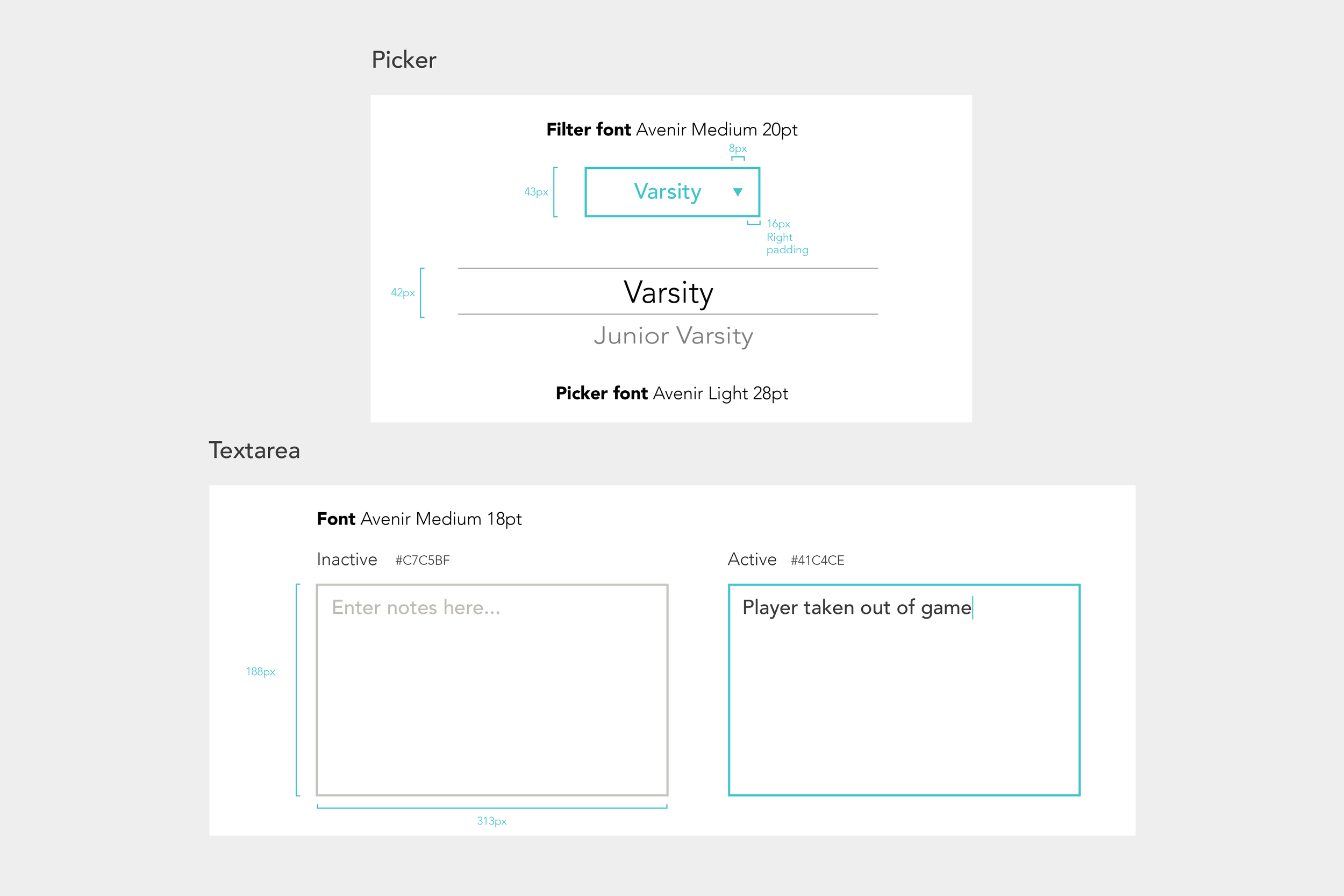
step 4: FINAL DESIGNS and style guide 🖌
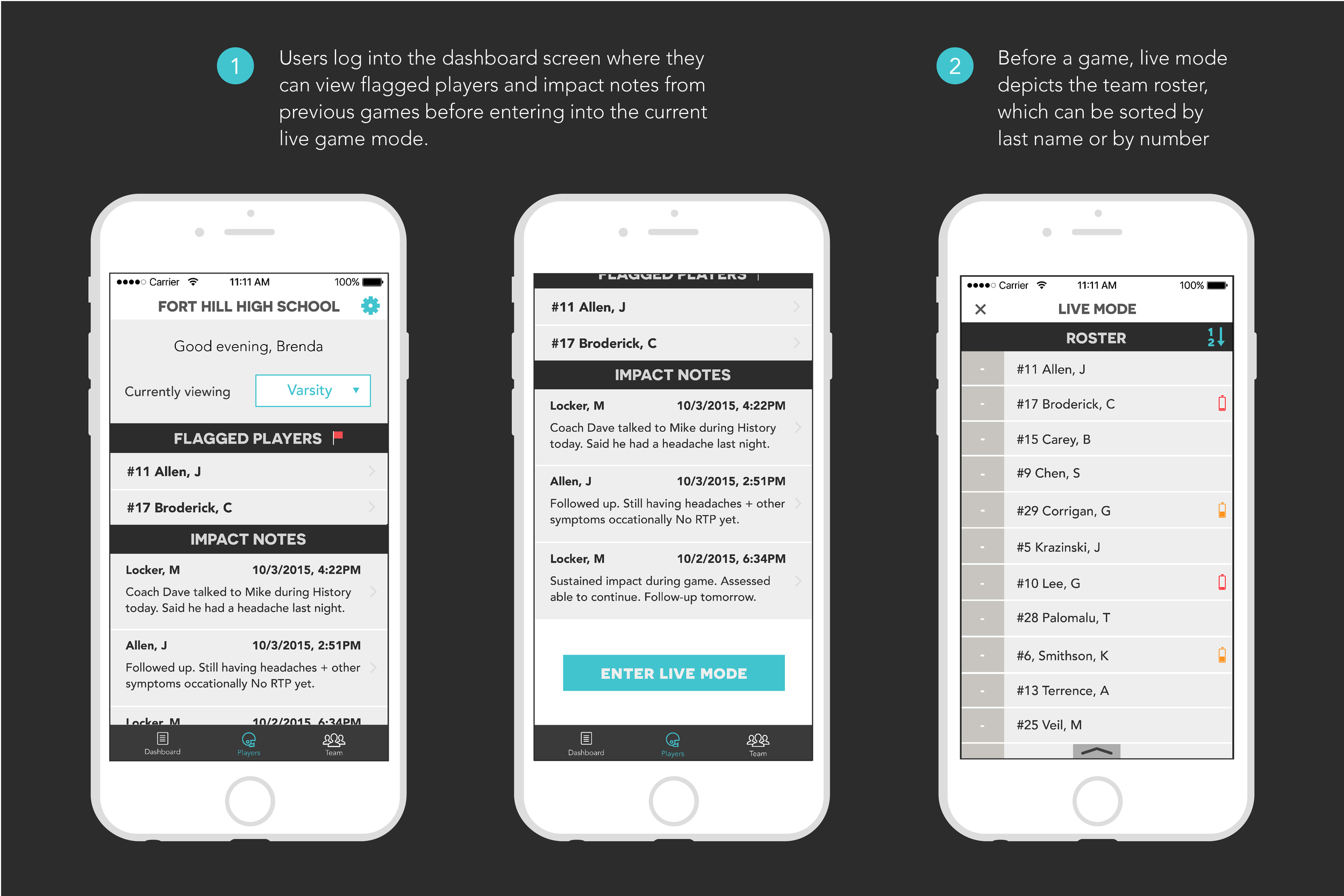
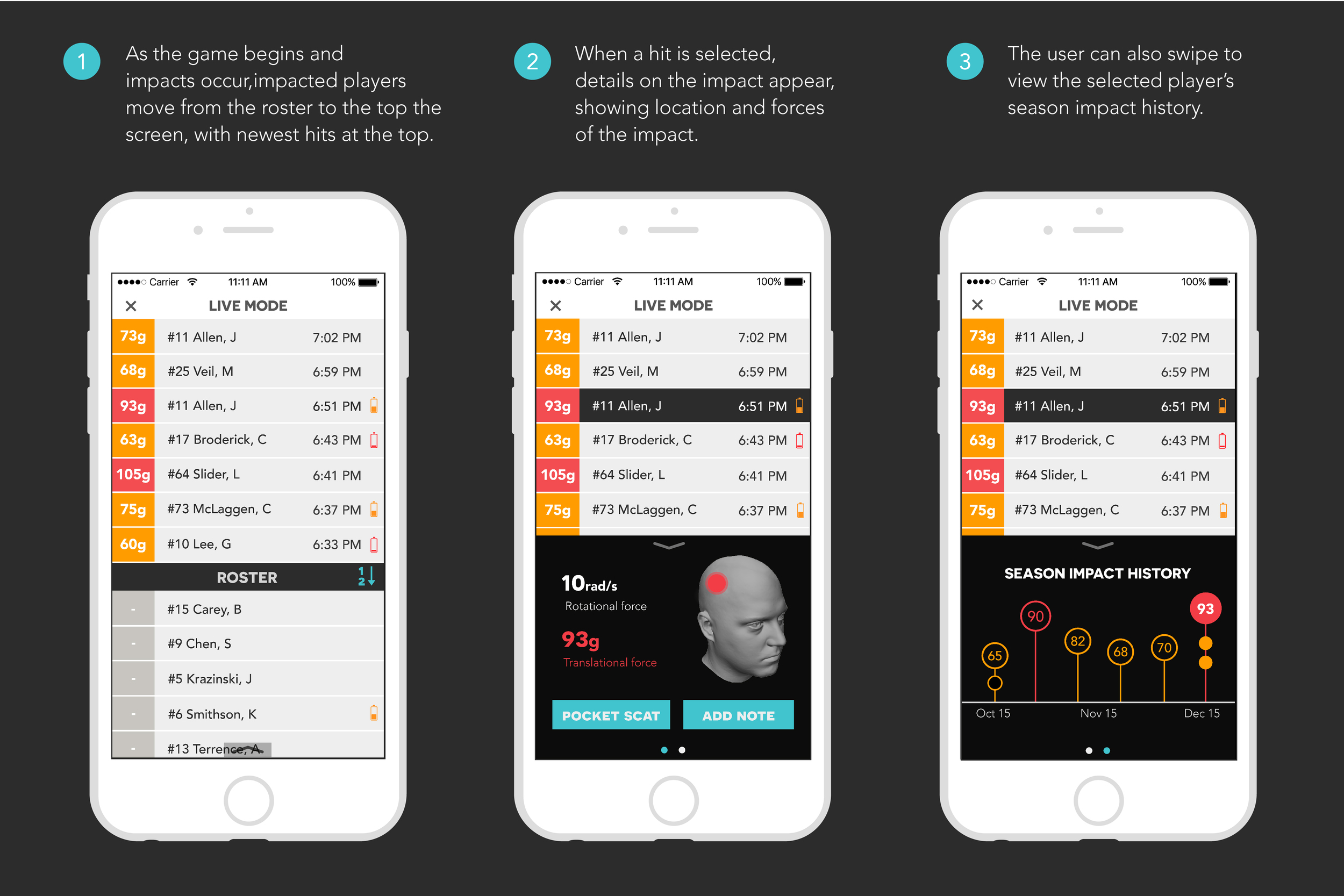
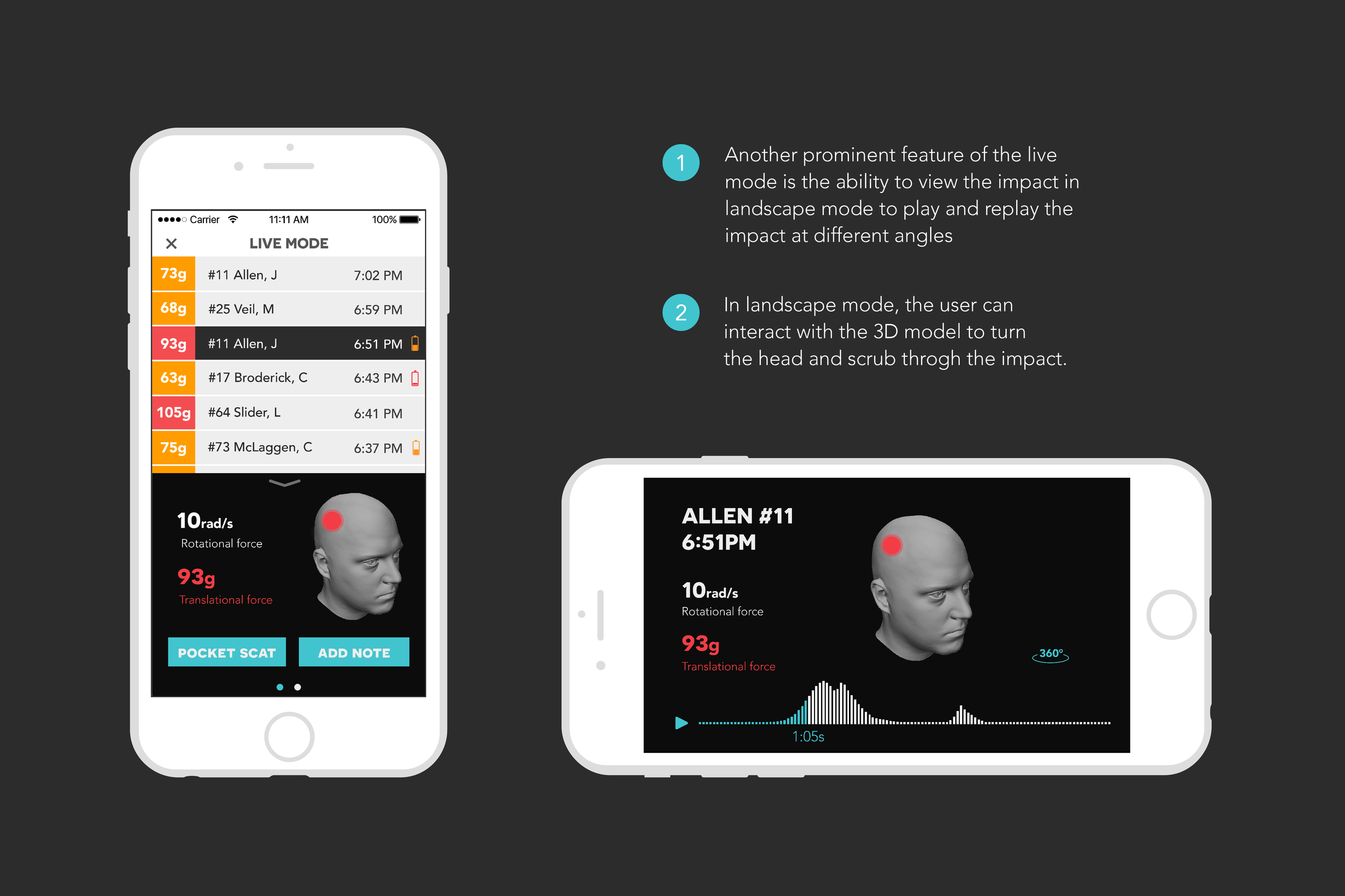
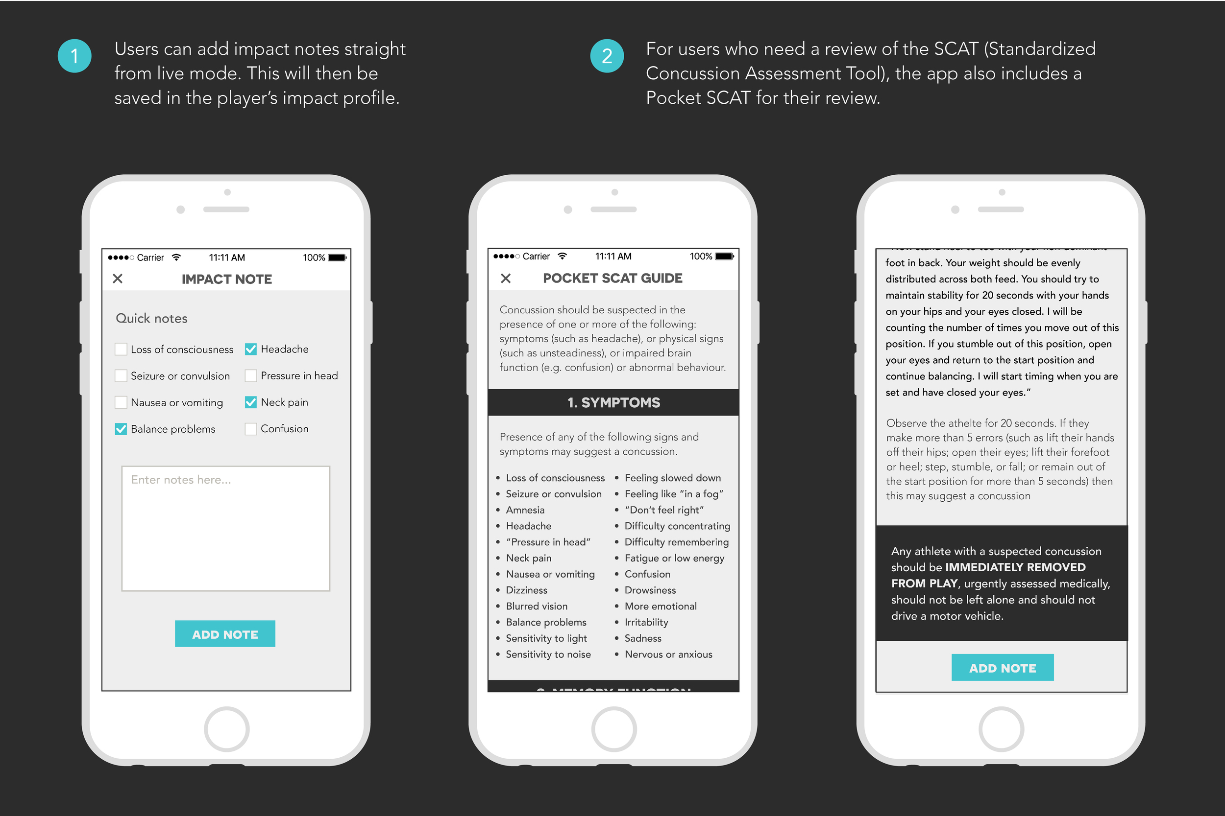
Designs were finalized after two rounds of client feedback. The below screens demonstrate user flows through the live game mode, impact profile and player profile.
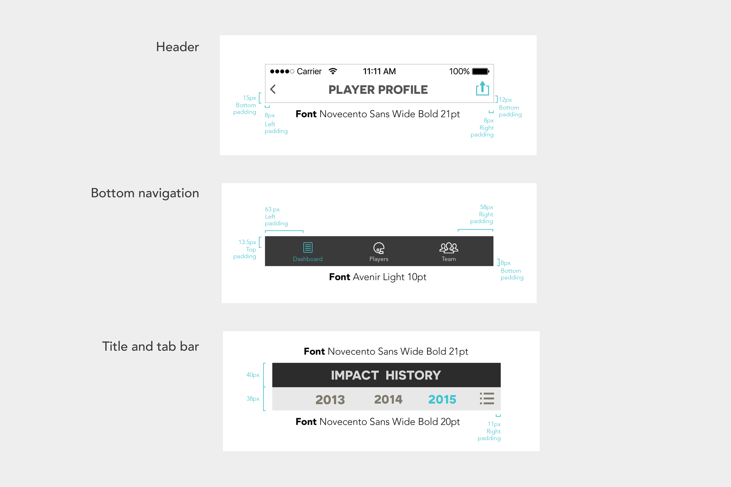
Finally, I also created an annotated style guide for our client’s development team.